Resource Metrics: Correlate Azure Activity
Overview
Resource Metrics Activity Markers in Spotto place activity-log event dots directly on the main metric chart. This helps answer the question:
“Did that configuration change happen right before this metric changed?”
Instead of forcing users to compare a chart and a separate event list by eye, Spotto overlays the event markers where they matter most: on the metric line itself.
Example
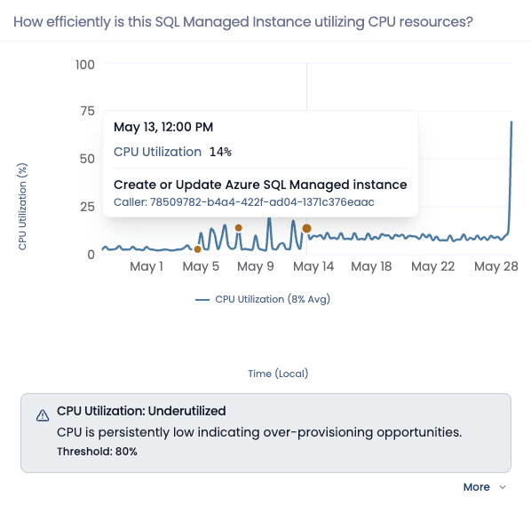
This example shows CPU utilization with activity markers overlaid on the chart. Hovering a marker reveals both the metric value at that point and the related Azure activity event.
Why use this?
Common pains
- Metric spikes are easy to see, but hard to explain.
- Activity logs exist, but comparing them manually against chart timestamps is slow.
- A separate event legend or label list often adds clutter without helping correlation.
What you gain
- A direct visual link between metric behavior and change events
- Faster validation of “before vs after” behavior after a configuration update
- Less chart noise, because markers stay inline and only reveal detail on hover
What you see
- Activity events are rendered as small markers on the main metric chart
- The markers do not live in the legend area below the chart
- Hovering a marker shows:
- chart timestamp
- metric value at that point
- activity event name
- caller or actor context (when available)
This design keeps the line chart readable while still exposing the operational event context only when you need it.
The hover details combine the metric reading with the related activity event, so it is easier to tell whether a change happened around the same time as a spike, dip, or recovery.
Best use cases
This visualization is especially useful for:
- VM or database configuration changes
- storage or network policy updates
- SQL Managed Instance resize or tier changes
- validating whether a change likely caused a spike, dip, or recovery
Technical reference
| Component | Details |
|---|---|
| Inputs | Resource metric history and activity log events for the same resource and time range. |
| Outputs | Main metric chart with inline event markers and event-aware tooltip content. |
| Defaults | Event markers appear only on the main chart. Event details are hover-based to reduce persistent chart clutter. |
Troubleshooting
I don’t see any event markers
What you’re seeing: The metric chart shows only the line. Likely causes:
- No relevant activity events are available for that window
- The selected chart is not the main marker-enabled chart
What to do:
- Check the Activity Logs tab for events in the same time range.
- Confirm you are looking at the main chart in the metrics section.
I see markers but no extra event detail
What you’re seeing: The marker is visible but the tooltip does not include the expected event context. Likely causes:
- The event record may not include caller or operation details
- The related activity event may only contain limited information
What to do:
- Hover the marker directly rather than only the line.
- Compare with the Activity Logs tab if you need the full raw event record.
Looking to enhance your cloud setup for cost efficiency, performance, reliability, or security?
Talk to a cloud specialist. Email us or schedule a 30-minute consultation and let's optimize your cloud environment together.
Book a Free Consultation